When it comes to creating a seamless user experience for your mobile app, even the most basic tooltips can make a significant difference. When done right, they elegantly guide users, minimize friction, and prevent potential roadblocks that could otherwise lead to frustration or abandonment.
Too often, however, tooltips are an afterthought, and instead of serving as intuitive aids, they frustrate users and detract from the overall app experience.
Here’s what you need to know about creating tooltips that not only educate but delight users as they navigate your mobile app.
What are tooltips?
Tooltips are a type of in-app message attached to a specific UI element or area on the screen. They are usually (but not exclusively) text-based and used to enhance onboarding, highlight key features, flag new updates, and provide contextual guidance during app usage.
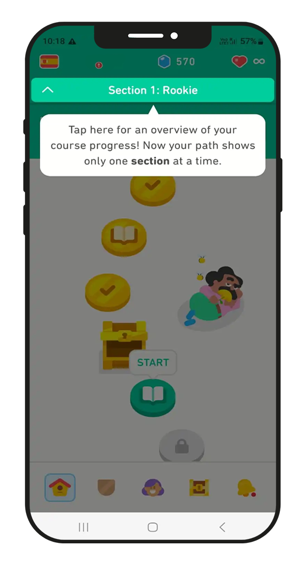
Tooltips act as friendly nudges towards an app’s core features and areas you want users to discover and adopt. They explain how your app works in bite-sized, digestible text boxes without interrupting your user’s workflow.
User onboarding tooltips
One of the main goals of onboarding is introducing new users to your app and helping them become familiar with your core features and capabilities. As users realize the value your app offers, they’re more likely to reengage and stick around. Quickly getting them to this point helps reduce the chance of onboarding abandonment and, ultimately, churn.
There’s a short window of opportunity to impress first-time users, which is why onboarding is so closely linked to retention and crucial for kick-starting long-term customer relationships.
During the First-Time-User-Experience (FTUE), tooltips act as helpful guides to your product tour or onboarding flow. For example, if a user decides to skip some of your onboarding, missing out on important feature tutorials, don’t worry. You can still share those insights bit by bit using tooltips.
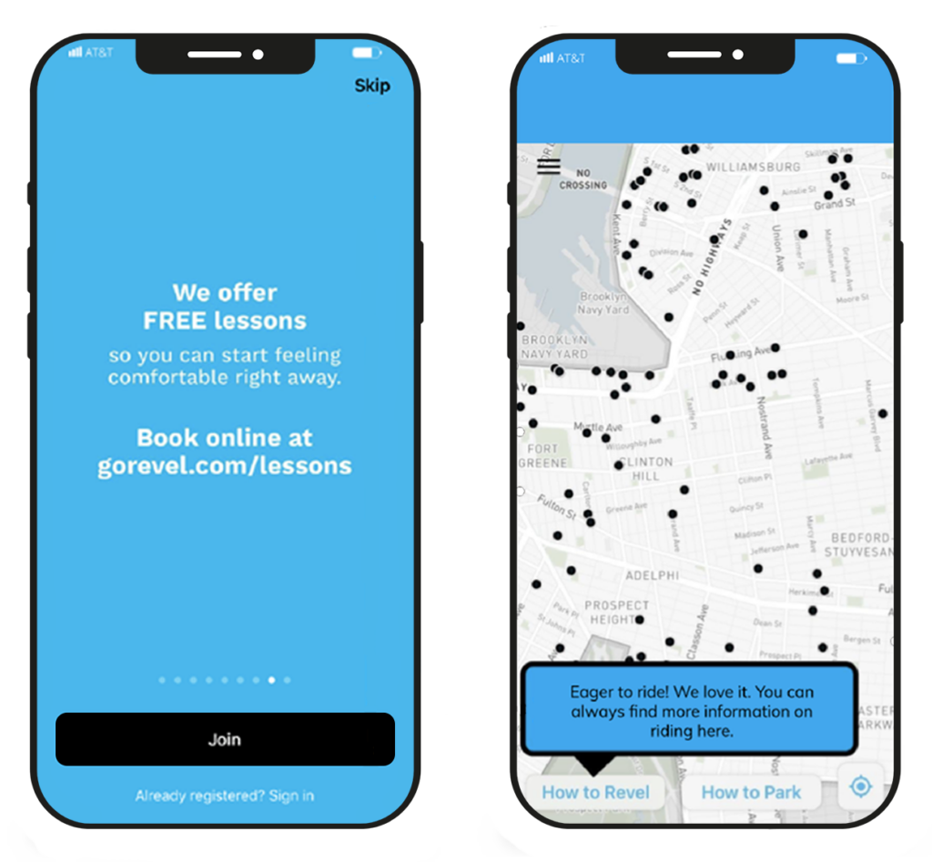
Or make tooltips part of your onboarding to encourage users to jump straight into using your app with the reassurance of guidance along the way.
Feature discovery tooltips
Helpful tips and guidance shouldn’t stop after onboarding. You want your users to continue exploring your app; even frequent visitors can miss important features tucked away in your app’s interface. So, instead of just hoping they’ll discover these features independently, draw attention to them with intuitive tooltip campaigns.
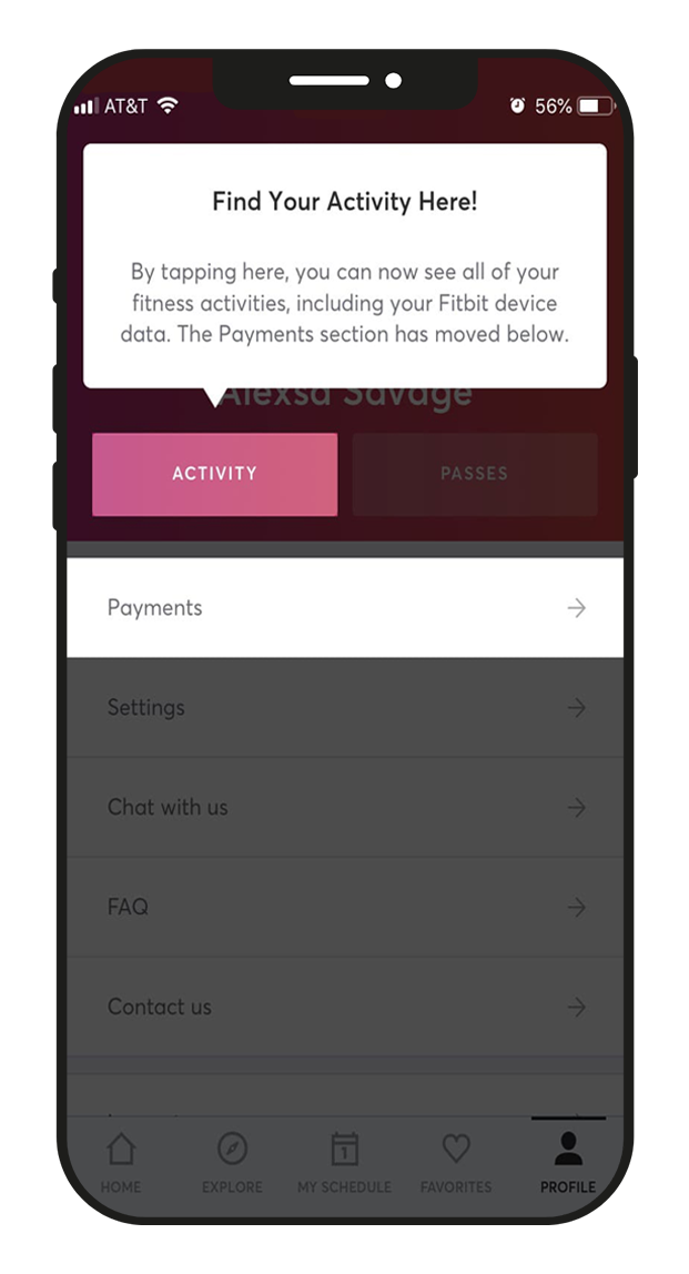
Build a tooltip to trigger when users visit a specific section of your app for the first time. For example, when someone registers for their first class on the wellness app, Mindbody, a helpful tooltip appears, pointing them to where they can find all their activities—a handy feature to learn about right at that moment.
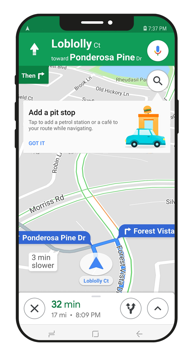
If a frequent user of your app seems to be overlooking a helpful feature or a simpler way of doing something, give them a friendly nudge in the right direction. Just as this navigation app demonstrates, analyzing user data can reveal opportunities to reduce friction points and enhance the user experience.
When a user creates multiple trips within a short timeframe or starts a journey from where they last stopped, this tooltip draws their attention to a feature they might have missed but could really help.
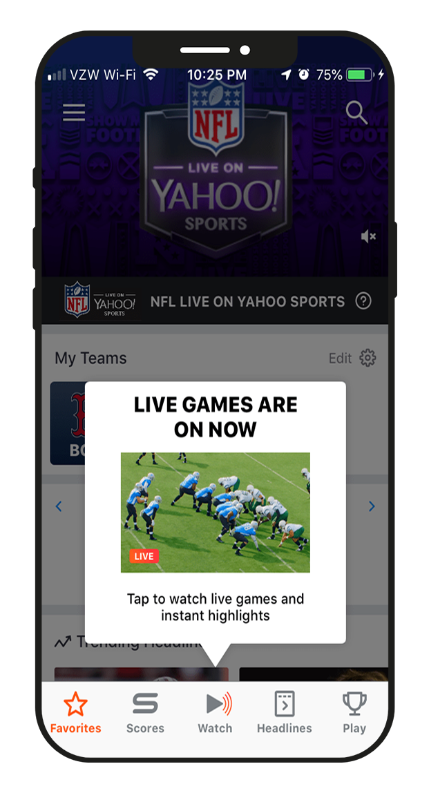
The Yahoo Sports app uses an eye-catching tooltip to let users know they can watch games and highlights directly within their app. Timing is everything here, as the tooltip triggers only when the campaign meets several criteria—the user has never used the feature before, is in the app while live games are showing, and is viewing the live scores section of the app.
New feature announcements
Introduce a new app feature at the precise time a user would likely need it and understand its value. This approach sees much higher engagement and feature adoption rates compared to, say, announcing it in a push notification or when the user next launches the app.
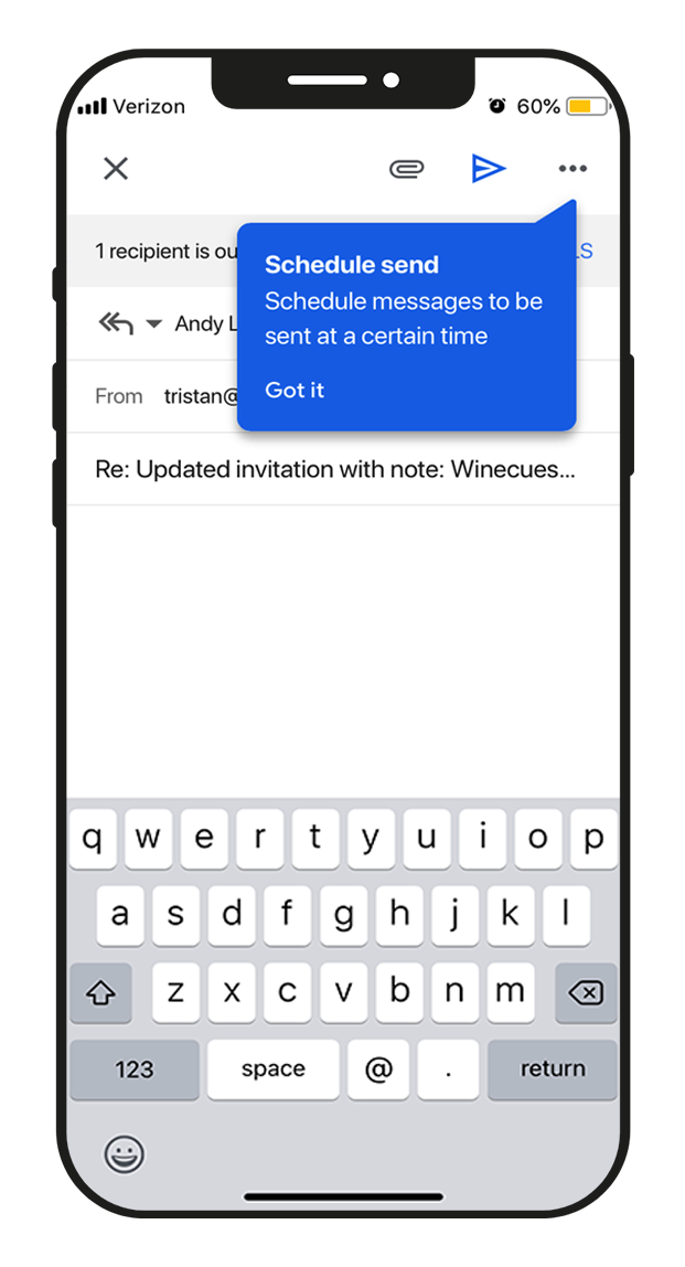
Take Google, for example. When they added Gmail’s new scheduling feature, they used a perfectly timed tooltip to let users know about it.
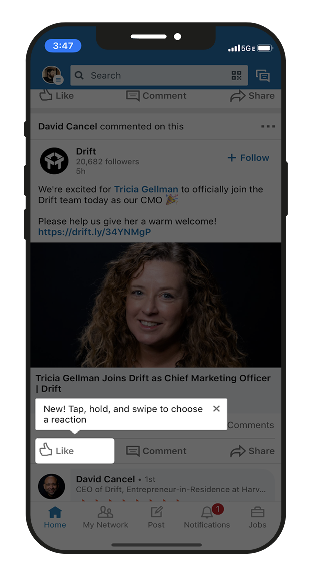
Likewise, when LinkedIn rolled out post reactions back in 2019, they opted for a low key, minimalist tooltip to highlight the new feature. It gave users just enough information in the pop-up to pique their curiosity and encourage them to dive in and explore it on their own.
Social sharing prompts
We all know that peer recommendations pack a powerful punch. When a user shares content from an app with a friend, it’s like telling them, “Hey, you need to check out this app.”
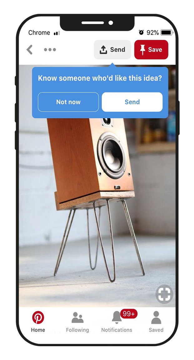
Pinterest understands this and uses in-app tooltips to familiarize users with their sharing functionality. The user learns about a valuable tool to help them collaborate with friends, while Pinterest gets the app in front of new and dormant users. It’s a win-win.
With any feature awareness campaign, make sure to segment your audience so you’re only sending it to those who haven’t used it yet. Targeting the right users with relevant recommendations ensures you deliver value where and when it matters most.
Tooltip best practices
Unlike web, mobile tooltips have limited real estate due to smaller screen dimensions. There’s less room for lengthy copy and fewer options for placement. What might seem subtle on a large screen feels much more prominent on mobile where every element counts. As a result, the best mobile tooltips deliver concise yet impactful information in a small space, all while respecting the user’s app experience.
Here are some tooltip best practices for making the most of your condensed creative space:
Keep it short and punchy
Tooltips with minimal text and no more than three lines in length perform better and are easier to read. If you need to say more, break up longer messages across multiple tooltips, so readers can digest all the information. If it helps, use short-hand–but not to the point of confusion. Stick to familiar acronyms and abbreviations your audience will grasp.
Give the option to opt out
Many users will still prefer to explore your features on their own. To avoid disruption, make sure they can easily ‘X,’ skip, or dismiss your message or tour in a single tap. For a more conversational exchange, use a confirmation CTA such as ‘Got it’ or ‘Ok, thanks.’
Add contrast to your tooltip design
Draw users’ attention to your tooltip by ensuring enough contrast with the rest of your UI. Be mindful of accessibility—grey tooltips on a white background might be difficult for visually impaired users to differentiate.
Maintain consistency
Maintain a consistent design style to create a cohesive user experience and help users quickly recognize tooltips when they appear. While tooltips should catch users’ attention, the design should still align with your brand’s visual identity, including colors, typography, and overall style.
Positioning your tooltip
Position tooltips close to the relevant UI element but without covering the element itself. Try to avoid covering areas of the screen the user could be viewing or engaging with at the same time the tooltip appears. Test different placements to discover the sweet spot that best guides users and leads to higher engagement.
Adding value with mobile tooltips
Striking a balance between guiding your users and just letting them do their thing is a delicate art. Take a thoughtful approach to your mobile tooltip campaigns by always considering the who, when, and why. Remember, tooltips are helpful annotations intended to enhance the user experience, not overpower it.
Ready to create personalized, brand-aligned tooltips for your mobile app? Our experts can show you how—no developer resources required. Book a demo and start taking your app’s user guidance to the next level.

